SRP Power mobile app
Transforming the utility experience: How I built SRP’s first-ever mobile app for 1M+ active power users.
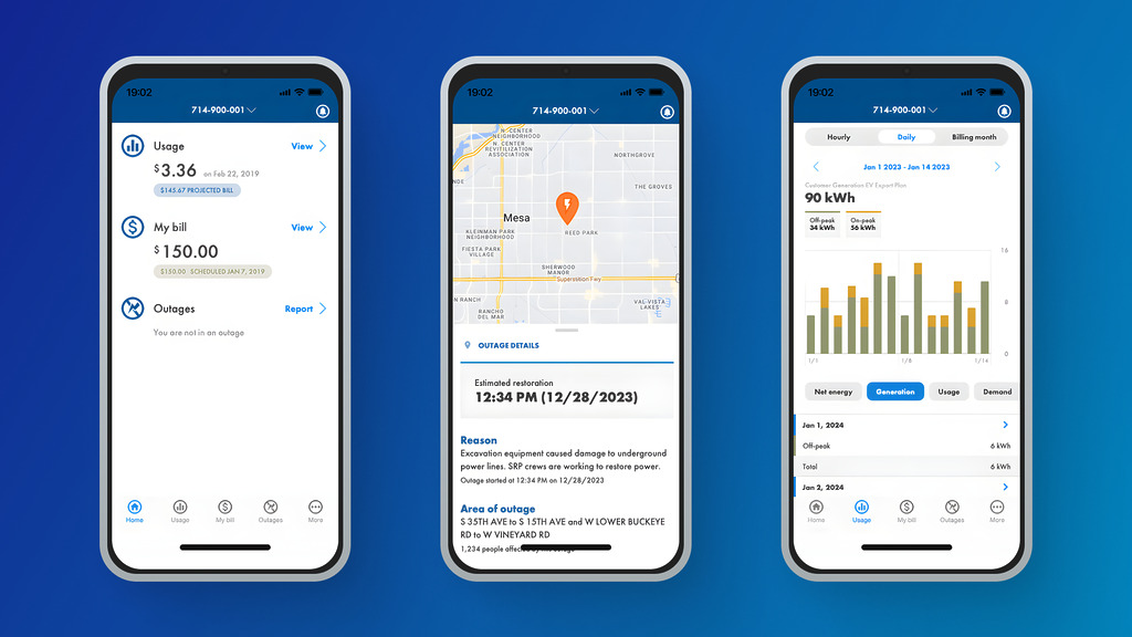
Screenshots from the SRP Power mobile app
The problem
SRP My Account users lacked a mobile app
SRP My Account customers couldn’t access their electric utility information from a mobile app. In interviews, users said the lack of one made SRP feel outdated and disconnected from what they needed. It affected every active My Account holder, and stakeholders asked for a dedicated app for each account type (monthly billed electric, pay-as-you-go electric, and water).
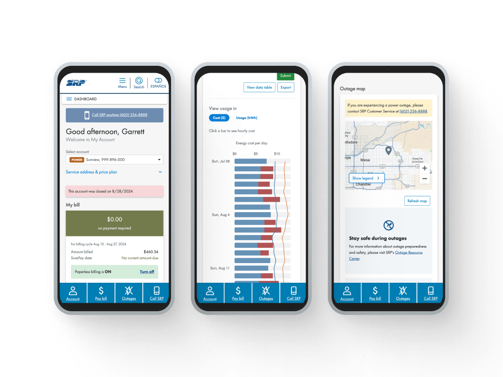
Power Account mobile web experience
Stakeholder influence on design decisions: While the research team identified key features, some stakeholders leaned on their own opinions about how the app should behave rather than the user-centered recommendations. One example: a rule that all content had to be visible without scrolling, which affected screens like the Dashboard and Usage pages.
Development in a hybrid toolkit: To save time, leadership chose to build the app in Ionic, a hybrid cross-platform toolkit, instead of native Swift and Jetpack Compose. That came with tradeoffs: some platform-specific features weren’t available, and the app took extra effort to tune across devices and operating systems.
Objectives
Design for every persona
Design a mobile-optimized experience that works both for users who want to knock out core tasks fast and for those who want access to every web feature.
Make it accessible and focused
Provide fast navigation and strong accessibility. Keep the main tasks (paying a bill, reporting an outage, checking usage) easy to reach, and keep cognitive load to a minimum.
Provide lasting value
Success meant getting at least 30% of active, non-solar residential My Account power accounts signed up for the app within the first 12 months post launch.
Approach
Research
Before the SRP Power app, customers could only manage My Account services through SRP’s website. That worked, but it left users without the flexibility they’d started to expect from other service providers, most of whom already offered dedicated mobile apps. It was clear an intuitive, mobile-first solution was needed.
To make sure the app actually met user needs, the research team combined usability testing, user interviews, and surveys. Usability tests ran in iterative cycles, with each round feeding directly into the next design pass. Interviews used questions like “What do you currently use My Account for?” and “What current website features would be most important to have in an app?” Surveys backed up these findings with quantitative data from a larger sample of users.
Key insight: users wanted core features like bill payments, usage data, and outage reporting easily accessible at any time, plus the ability to manage accounts (both SRP and bank) and receive push notifications.
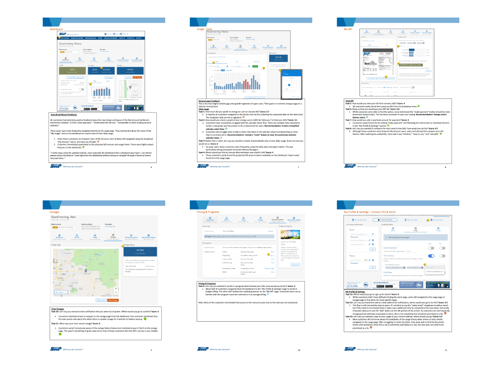
Example usability testing script
Design
Based on what the research surfaced, the goal was to make paying balances and reporting outages effortless, and to make usage charts intuitive and engaging.
Streamlining forms: the website’s payment flow had a form, a confirmation page, and a submission page. For the app, we dropped the confirmation step and prefilled the form with default values for quicker submission. Optional outage-alert fields also came off the report-outage form to cut down on cognitive load.
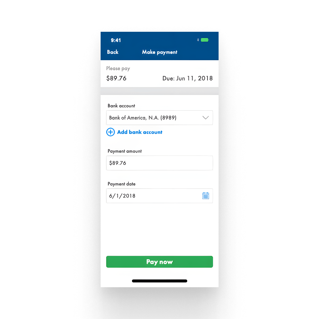
Make payment by bank account
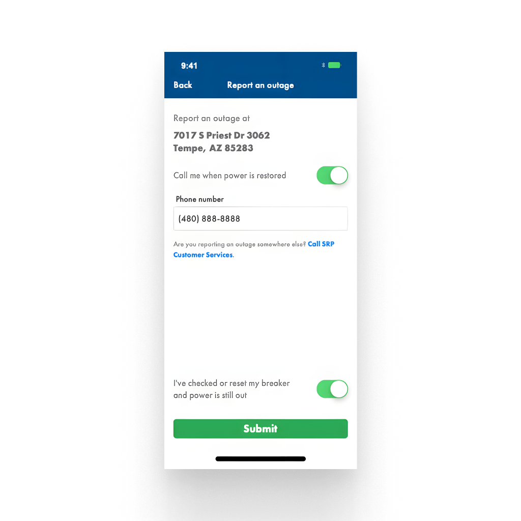
Report outage form
Simplifying usage charts: the mobile web experience used a horizontal bar chart to fit large date ranges. The app capped that range for readability and dropped the average-temperature overlay so the focus stayed on usage. The hourly chart went from a radial design back to a standard bar chart after users’ initial excitement about the radial version wore off.
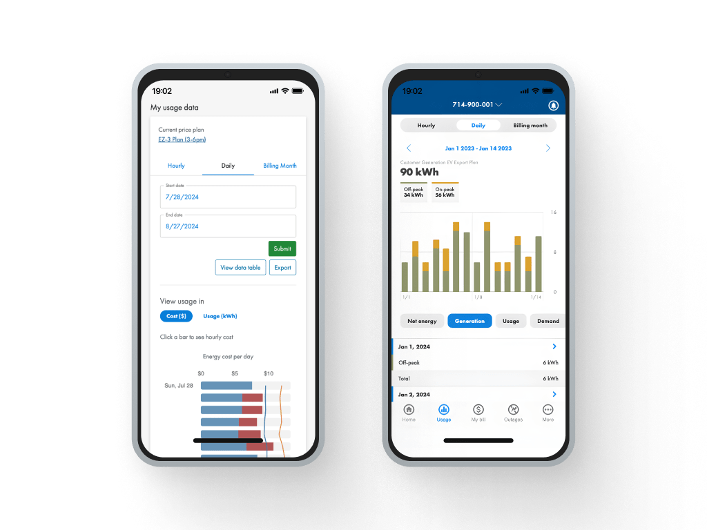
Mobile web (left) and app usage (right) comparison
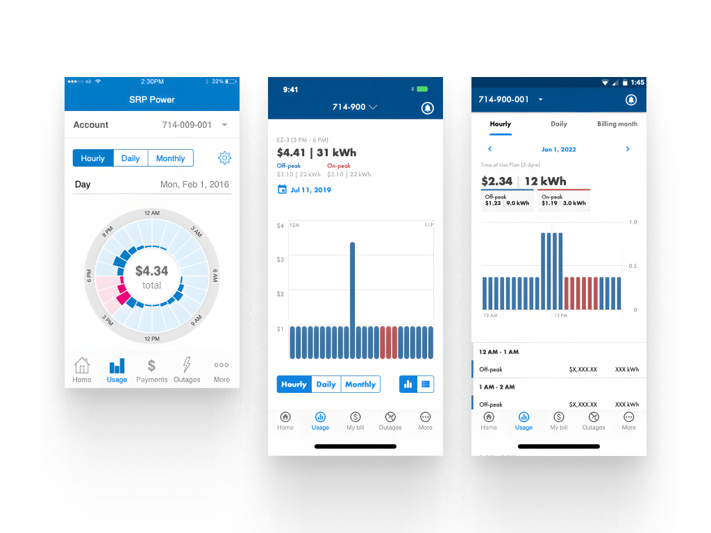
Daily usage chart updates (1.0 → 3.0)
The usage data table started as its own view separate from the charts, then got merged into a single view after feedback that the original layout felt cramped. The updated layout shrank the chart a bit and gave the data a clearer visual hierarchy.
Usage section updates: charts and data table combined into a single view
Execution
Mockups and functional prototypes lived in Axure RP, with Photoshop and Illustrator used for custom icons and imagery. The initial release was built in Ionic, a hybrid cross-platform toolkit. Later releases gradually introduced Jetpack Compose and SwiftUI for specific pages.
As the UX Designer, I built high-fidelity mockups and interactive prototypes for stakeholder alignment and usability testing, and worked closely with developers to implement navigation, payment forms, and usage graphs. I also joined sprint meetings to give design feedback and keep the app consistent.
Impact
Users praised the simplified dashboard and payment flow, real-time push notifications for account status and outages, the convenience of mobile bill pay and usage tracking, and clearer account-management features, especially the updated Usage section.
The app met growing demand for modern self-service tools, reduced cognitive load, and led to fewer support inquiries, all of which reinforced SRP as a forward-thinking, customer-focused company. After SRP’s move to a third-party My Account platform, future updates to the Power app will come from that vendor.
Reflections
Building SRP’s first mobile app was one of the most impactful projects of my career. While the product successfully drove adoption and exceeded many of its business goals, looking back there are a few areas where I would further strengthen the design process today.
Broaden Validation Beyond Usability
The dashboard and several core workflows tested well in moderated usability sessions, but I would complement that qualitative feedback with larger-scale quantitative validation. Combining usability testing with A/B experiments or behavioral analytics would provide greater confidence that design decisions also improve real-world engagement across a broader customer base.
Ship Smaller, Learn Faster
Given today’s product experimentation tools, I would advocate for releasing certain improvements behind feature flags or to smaller customer segments before rolling them out broadly. This would allow the team to validate assumptions earlier, reduce implementation risk, and iterate more quickly based on actual customer behavior.
Measure Long-Term Customer Success
Our primary success metrics focused on adoption, task completion, and feature usage following launch. If I were measuring success today, I would also evaluate longer-term indicators such as customer retention, repeat engagement, and satisfaction over time to better understand the app’s lasting impact on the overall customer experience.
Design Systems Mature With Products
This project helped shape my perspective on scalable design systems. While we established reusable patterns throughout the app, I now place even greater emphasis on designing components and interaction patterns that can evolve alongside the product, making future features faster to build while maintaining consistency across experiences.