SRP M-Power app
UX case study on designing SRP’s mobile app for pay-as-you-go customers. Purchase power, request credit advances, and manage an M-Power account without leaving the phone.
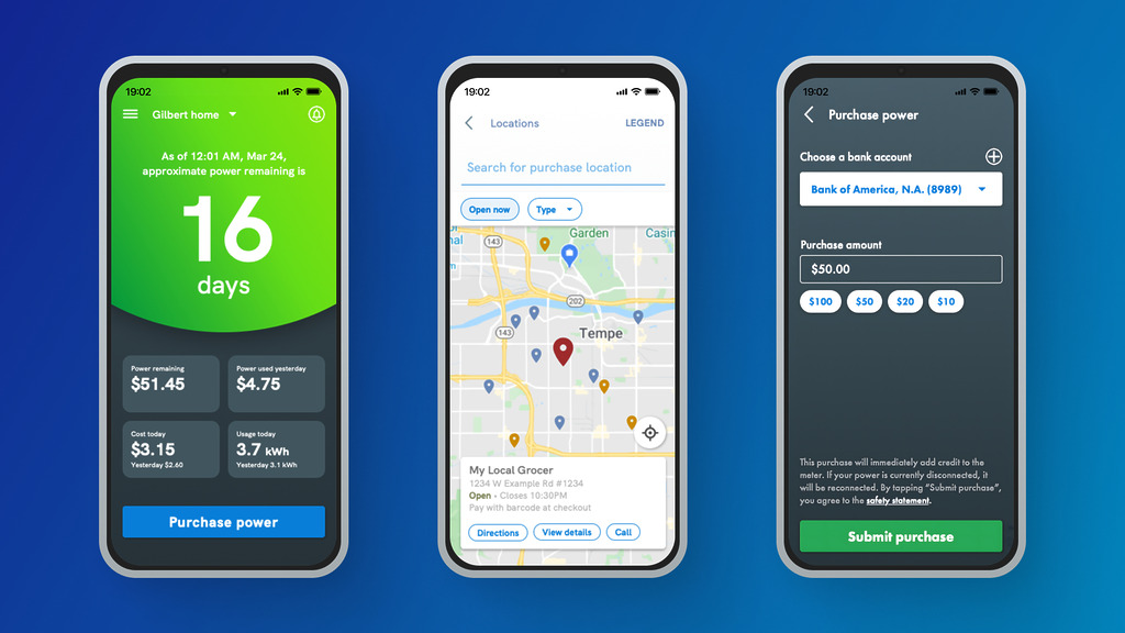
Screenshots from the SRP M-Power mobile app
The problem
M-Power customers had no dedicated mobile app
Customers on SRP’s M-Power pay-as-you-go plan had no mobile-first way to view or manage their accounts. In user feedback, the missing app read as a signal that SRP wasn’t putting them first. It affected every M-Power customer, and stakeholders pushed for a dedicated app to fix both the experience and the perception.
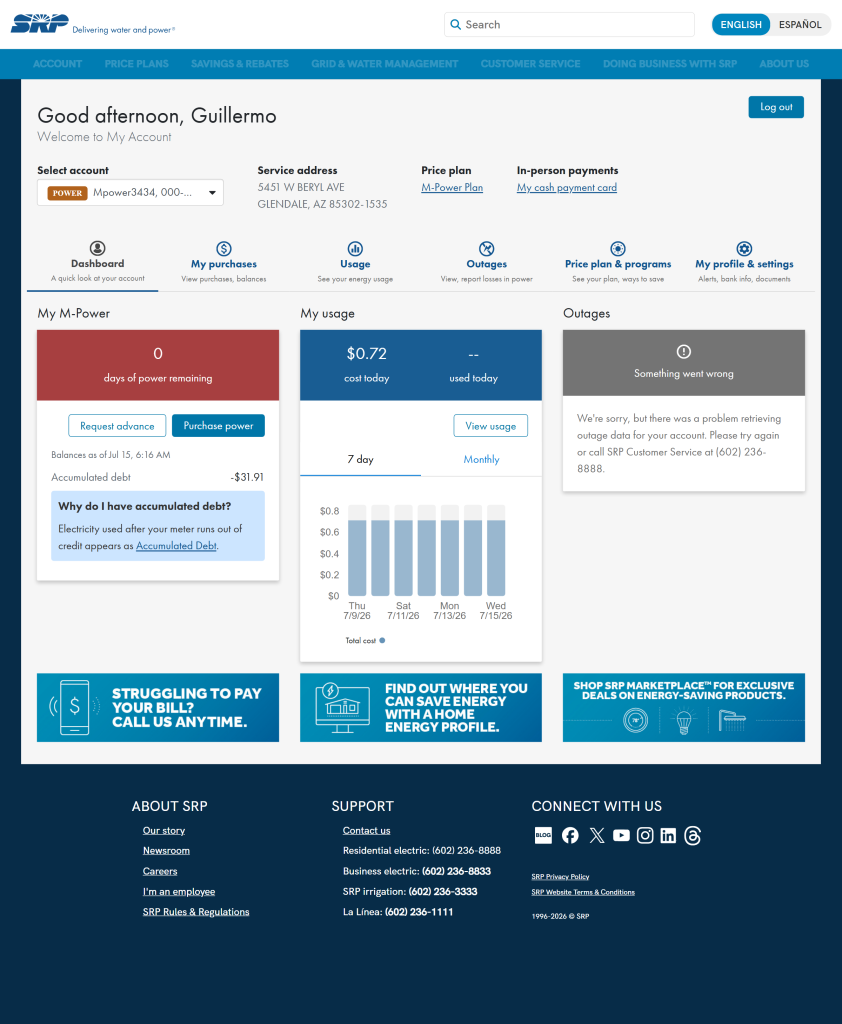
M-Power web experience. The only way to manage accounts before the app.
Stakeholder-led Dashboard: the main Dashboard was almost predetermined by a stakeholder who had a very specific look and behavior in mind. That left little creative room to explore how the Dashboard could actually work best for customers, even after research pointed at alternatives worth trying.
Hybrid development stack: to save time, leadership chose Ionic (a hybrid cross-platform toolkit) over native Swift and Jetpack Compose. That came with tradeoffs. Some platform-specific behaviors weren’t available, and getting the app to feel right across devices and operating systems took extra tuning.
Objectives
Design for M-Power personas specifically
Give M-Power customers a mobile-optimized experience where they can manage their account and knock out common tasks quickly. Not a generic My Account port. Something built for how they actually use it.
Keep the core tasks dead simple
Streamline the flows M-Power customers hit most: purchasing power, requesting credit advances, and general account management. If it takes more than a couple of taps, we did it wrong.
Earn returning users, not just downloads
Success was measured first by adoption rate (were people downloading and signing up), then by retention (were they still coming back weeks and months later). Long-term engagement was the goal, not a launch-day spike.
Approach
Research
M-Power customers could technically manage their accounts on SRP’s website, but not having a mobile app made everything less convenient. That gap started to feel like a signal to customers that SRP wasn’t prioritizing their side of the business.
To make sure the app actually met M-Power customer needs, the research team combined usability testing, user interviews, and surveys. Usability tests ran in iterative cycles with a mix of M-Power price plan users, with each round feeding into the next design pass. Interviews explored questions like “What do you currently use My Account for?”, “How often would you use an app like this?”, and “What current website features would be most important to have in an app?” Surveys backed up the qualitative signal with quantitative data from a larger sample.
Key insight: what M-Power customers wanted most was fast, intuitive power purchases. That was the single most-used task, sometimes multiple times per day. After that, everything else was in service of it. Viewing purchase and usage history, requesting credit advances, managing the account, and getting push notifications when balance was running low.
Design
With the research pointing at fast power purchases as the primary task, the design work focused on three things. The Purchase Power form itself, how it handled negative balances, and the Dashboard that customers would see every time they opened the app.
Improving the Purchase Power form: the website version made customers manually type in an amount every single time. For the app, we added preset purchase amounts based on common values, which let a completed purchase take as few as two taps. Other presets we scoped but didn’t ship in the initial release included “last purchase amount” and “amount owed to SRP.”
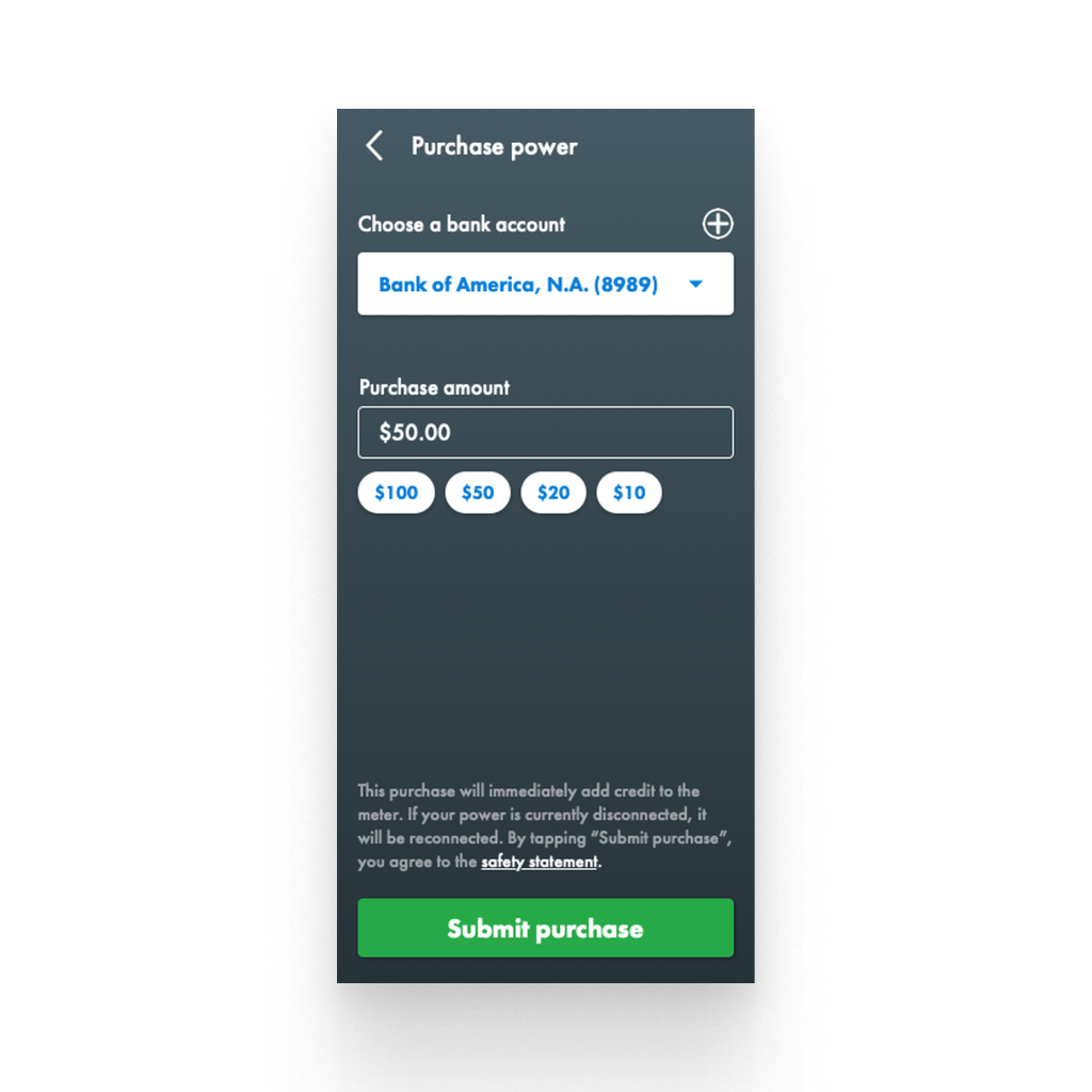
Purchase Power form with preset amounts.
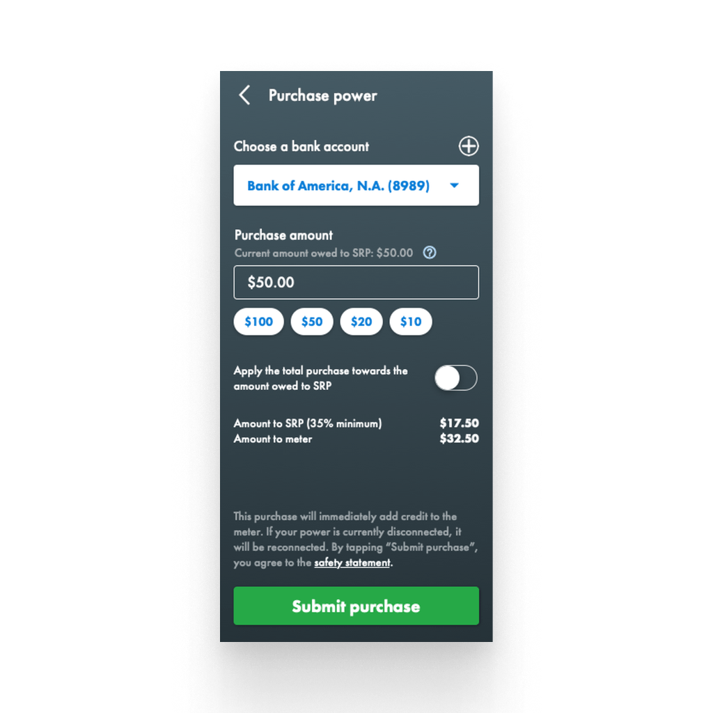
Purchase Power form with an arrears balance.
Clear communication of purchase distribution: when a customer had a negative balance, the app showed a clean breakdown of how their purchase would split between paying SRP and topping up the meter. Customers could also route their entire payment toward what was owed to SRP, so anyone trying to zero out their arrears could do it in a single transaction.
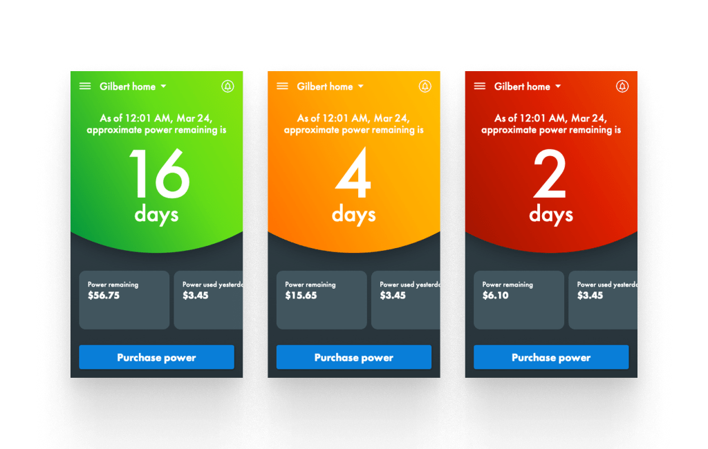
M-Power Dashboard variations.
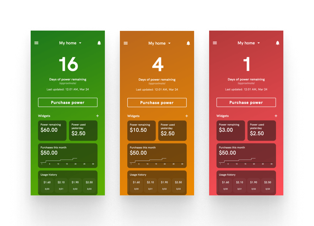
Updated Dashboard concept, proposed but not shipped.
One data point to rule them all: the whole point of the Dashboard was to answer one question, how much power is left. So we gave that value the majority of the screen, plus a background color that shifted to reinforce the state at a glance. The primary call to action was “Purchase Power” because that was overwhelmingly the most common action, sometimes multiple times a day. Later versions added a small strip of secondary stats so customers could get a quick read on recent usage without drilling deeper.
Prototype used in user testing for the walk-up payment feature.
Execution
Mockups and prototypes lived in Axure RP, with Adobe Photoshop and Illustrator for custom icons and imagery. The initial release was built in Ionic, a hybrid cross-platform toolkit. Later releases gradually brought in Jetpack Compose and SwiftUI for specific pages that needed platform-native behavior.
As the UX Designer, I owned the mockups and interactive prototypes for stakeholder reviews and usability testing. I worked closely with developers to translate designs into functional UI components, including the purchase forms, Dashboard, and account management flows. Regular sprint meetings kept design feedback flowing early enough to catch inconsistencies before they landed in production.
Impact
Customers consistently called out the intuitive Dashboard as the standout. Knowing how much power was left at a glance was the single most important thing, and the app made it obvious. Being able to purchase power from anywhere (rather than driving to a kiosk) and request credit advances directly from the app were also big wins. Real-time updates on “power remaining” meant customers could actually trust the number, and low-balance push notifications became the safety net that kept them from getting caught short.
The app’s success let SRP remove all of its owned PayCenter kiosks across the Phoenix area. Customers could now make purchases from their phone rather than driving to a physical location, and the popularity of in-app credit advances alone dropped Call Center volume by 41% year over year. Following SRP’s move to a third-party My Account platform, future updates to the M-Power app will come from that vendor. Before that transition, there were early designs for a customizable Dashboard where “Power Remaining” would stay pinned as the primary stat, with everything else controlled by widgets the customer could add, remove, and reorder.
Reflections
The M-Power app was one of the more impactful projects I have worked on. Massive adoption, a real business outcome (kiosks removed), and clear signal from customers that the design decisions landed. Looking back, there are still a few things I would do differently next time.
Broaden validation beyond usability
The Dashboard and core workflows tested well in moderated sessions, but I did not push hard enough to also measure whether the M-Power app was changing customer behavior in the ways that would matter to the business. Adoption and task completion are important, but by themselves they do not tell you if you have genuinely improved someone’s week-over-week experience. Next time, I would pair usability testing with a small set of business and behavior metrics defined at the start of the project, so the value story does not have to be pieced together from launch data alone.
Ship smaller, learn faster
With today’s product experimentation tools, I would advocate for shipping specific pieces of the M-Power app as smaller, A/B-tested releases rather than one large launch. The presets on the Purchase Power form, the color-shifting Dashboard, and the credit advance flow could each have gone out as an experiment to a subset of users first. That would have generated real behavioral data to inform how the next piece got built, rather than relying on stakeholder confidence to greenlight each decision.
Measure long-term customer success
Our primary success metrics for the M-Power app were adoption, task completion, and feature usage. All valid, all point-in-time. Long-term customer success is trickier. Are customers less likely to lose power because of the low-balance push notifications? Are they carrying smaller arrears balances year over year? Those are the metrics that would have proven the app’s value to the business, and I would build a lightweight framework for tracking them at the start of the next project.
Design systems mature with products
The M-Power app helped shape my perspective on scalable design systems. We built consistent components for the app, but they lived alongside the design language of My Account rather than being unified into a shared system. If I started this project again, I would invest early in a documented, cross-product design system so that decisions made for M-Power could benefit the Water app, the Power app, and My Account, rather than being reinvented each time.