SRP My Account web portal
How a complete redesign of SRP’s My Account portal improved usability for 1M+ residential customers through dedicated experiences, streamlined journeys, and accessible design.
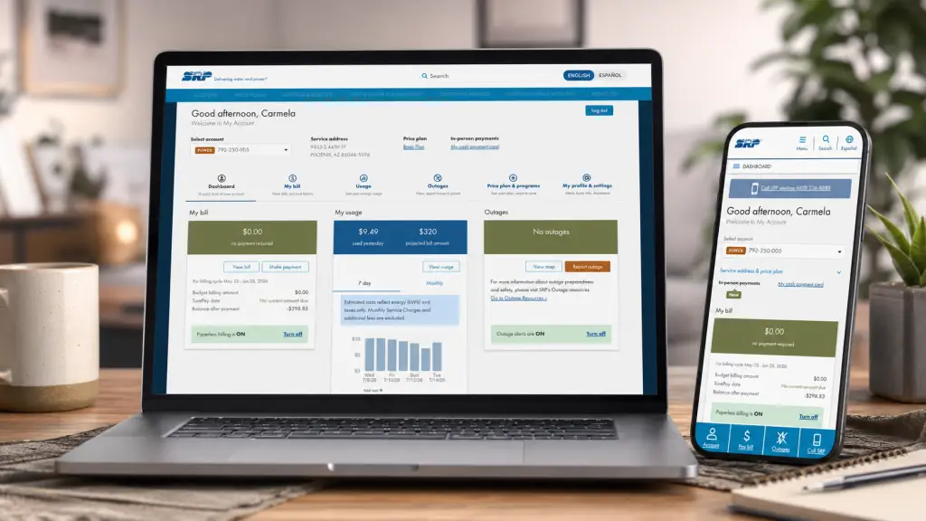
Screenshots from the redesigned SRP My Account web portal
The problem
The Dashboard was crowded and outdated
The original Dashboard tried to be everything at once. Payment, Billing, Usage, Feedback, and Quick Links were all crammed into a single view for Power customers, and if the customer was also a Water customer, that same list doubled. All of it lived on one screen. The result was a page that pulled attention in every direction and made even focused tasks feel harder than they needed to be.
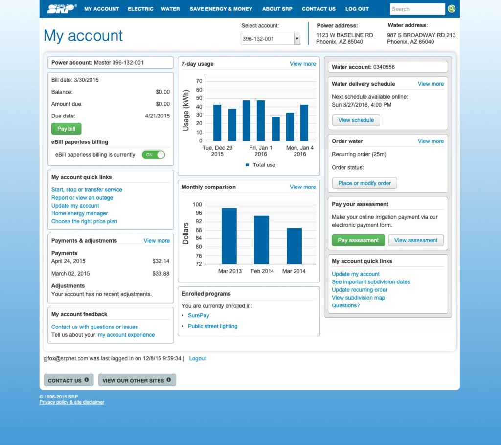
Original Dashboard view. Power and Water customer, 2018.
Balancing user wants with technical feasibility: during exploratory sessions, some customers asked for granular breakdowns of usage. Is my AC running fine? Are my other appliances drawing more than they should? The UI could have communicated that data clearly, but the underlying data infrastructure could not reliably decipher usage at that level. Some genuinely useful ideas simply were not feasible to build.
Getting past “we’ve always done it this way”: parts of the portal had been unchanged for years, and some stakeholders were resistant to reworking flows even when research pointed at clear improvements. A real part of the job was making the case for change (with data) until leadership saw the same picture the research team already did.
Objectives
Improve the tasks customers actually do
Cover the core Power tasks (paying bills, checking usage, reporting or viewing outages, managing an account) and the core Water tasks (paying assessments, ordering water, checking delivery schedules, general account updates) with flows that felt purpose-built for each rather than a shared checklist.
Separate the Power and Water experiences
The original Dashboard combined Power and Water content whenever a customer was enrolled in both. That doubled the cognitive load and made every task noisier. The redesign gave each service its own dedicated view, so customers could focus on one utility at a time without noise from the other.
Simplify what was already there
Most core tasks worked well enough, but there were plenty of small pain points that added friction across the day-to-day experience. Things like making a single payment across multiple Power accounts. Small quality-of-life fixes that added up to a noticeably smoother portal.
Approach
Research
At SRP, larger projects kick off with the Customer Insights team gathering background data to get a sense of how customers actually feel about the product and where the pain points are. That research got handed to me, and my job was to figure out how to translate the sentiment into design decisions that would hold up in practice.
For example, customers had voiced frustration with signing up for various SRP programs (automated payments, average monthly billing, and so on). The old forms required manually entering everything, which meant a long time on task and lots of chances to abandon partway through. The redesign eliminated manual entry entirely for anything the system already knew about a customer, so only the truly required fields were left to fill in.
Key insight from customer feedback: “I wish the Homepage was more simple. There’s just so much to look at.” That single quote from an anonymous customer captured what the quantitative data had already suggested. The Dashboard’s core problem was density, not features. The redesign started from that constraint.
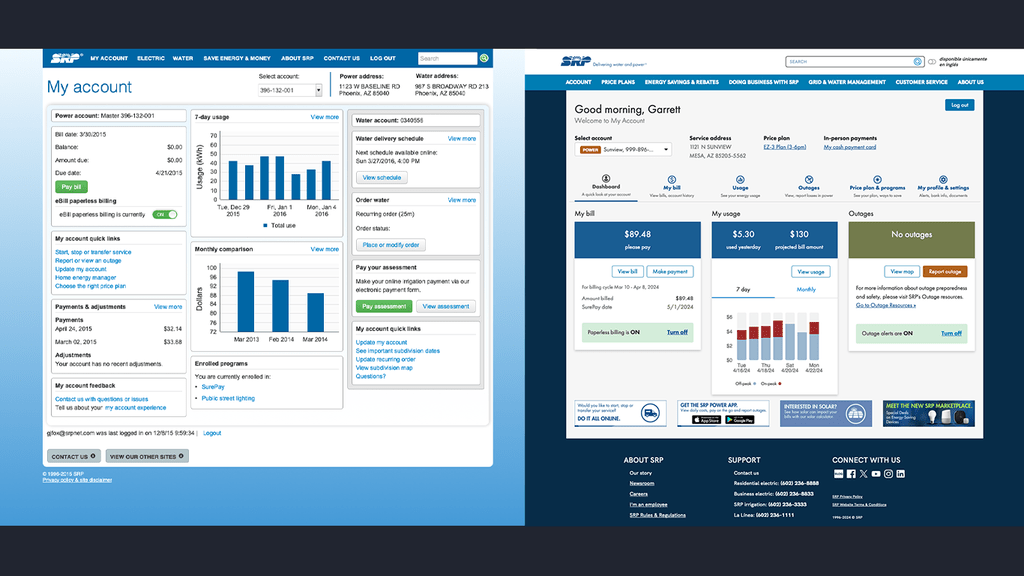
Dashboard, before and after.
Design
With research pointing at Dashboard density and task friction, the design work focused on three areas. Separating the Power and Water experiences, redesigning the Alert Subscription flow that came up repeatedly in feedback, and building the redesign on Material UI so it would feel familiar to customers with no prior exposure to SRP tools.
Redesigning the Alert Subscription flow: the old version was a hidden mess. Individual alerts had to be manually expanded to see their details and contact methods, removing a contact required a drag-and-drop that felt bizarre on desktop, and there was no way to know which phone numbers were actually verified for text messages. The redesign grouped alerts by category for scannability, made adding and removing contacts direct, and surfaced verification status where the customer could actually see it.
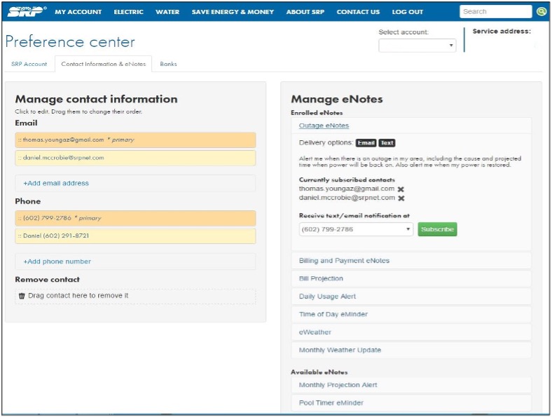
Preference Center page, 2018 original.
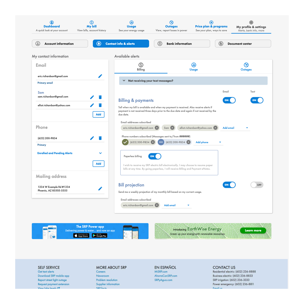
Preference Center page, redesigned.
Building on Material UI: SRP’s customer base runs the full gamut. First-time apartment renters, landlords managing multiple properties, recent high school grads, retirees. Whatever the redesign became, it had to feel familiar without being alienating. Material UI was already a widely-used design language, so leaning on Google’s component conventions gave customers a foundation they had already interacted with elsewhere, even if My Account itself was new to them.
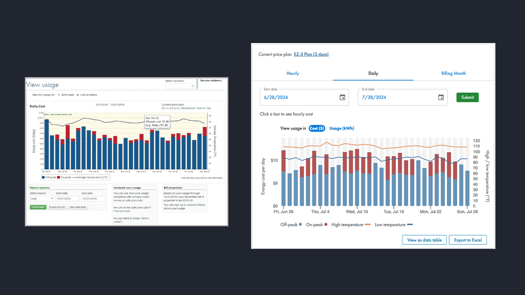
Daily Usage page, before and after.
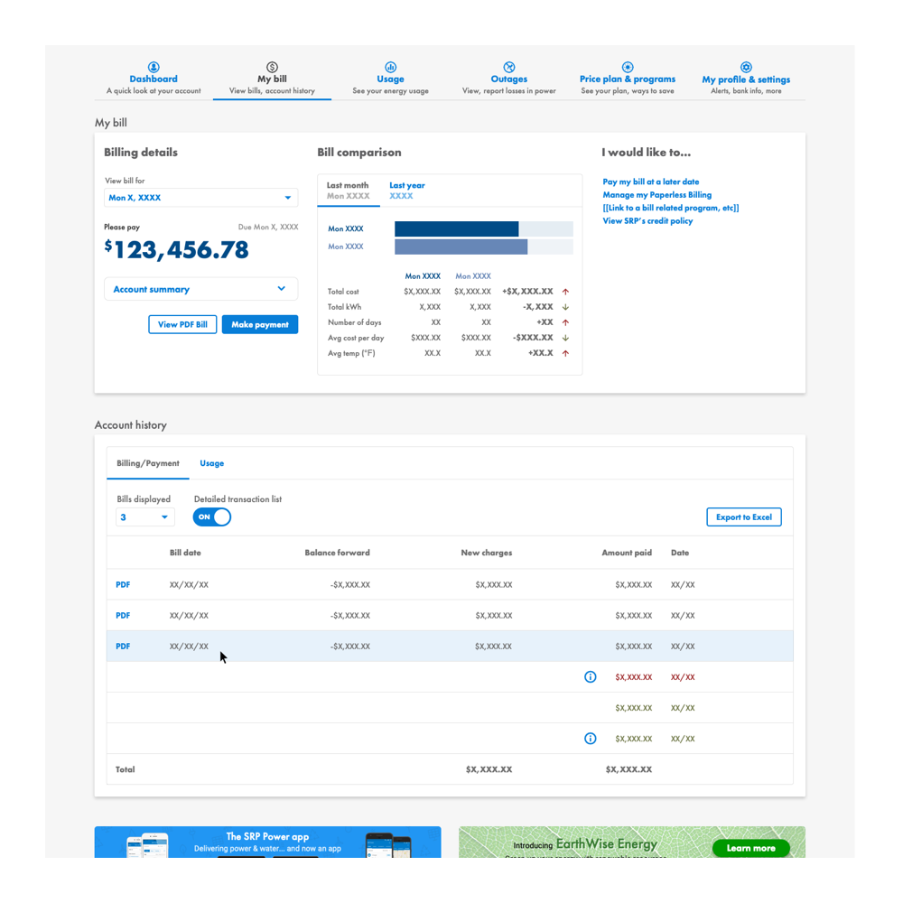
Proposed My Bill page update. Eliminates the embedded PDF.
Updating outdated features: the My Bill section still relies on an embedded PDF of the customer’s bill, which is a nightmare on mobile because scrolling past the bill is nearly impossible. I designed an update that eliminated the embedded PDF entirely, ran user tests with Customer Insights, and got strong feedback from immediate management. It has stayed on the backlog behind higher-priority projects, still queued up waiting for its turn.
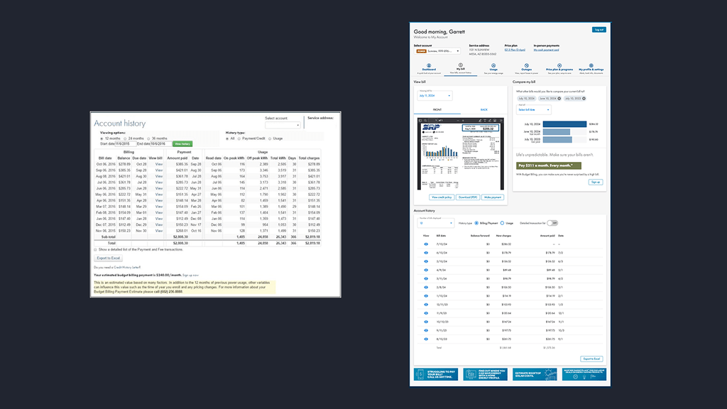
Account History and Billing, before and after.
Execution
Mockups and prototypes lived in Axure RP. The build itself used Material UI as the base React component library, with SRP-specific customizations layered on top for branding and specific interaction patterns unique to the utility experience.
As the UX Designer, my role sat at the intersection of Customer Insights research, business goals, and technical feasibility. I owned mockups and prototypes, collaborated with the researchers to make sure my design decisions matched what customers were actually asking for, and worked closely with developers to make sure what I designed could be built well within the project’s scope. When ideas were not feasible or stakeholders were not sold, part of the job was making the case with data until we could agree on a path forward.
Impact
Customer feedback held steady from the moment the redesign shipped. “The updates to the Preference Center are great. These pages seem so much easier to work.” That kind of comment showed up over and over in feedback surveys. Immediate reactions were mostly positive, with some concern about the updated look (which was expected, given the portal had not seen a major refresh in years). Once the customer base had a couple months to work with it, Customer Survey scores took a dramatic upward turn. Both overall satisfaction and ease of use climbed nearly 20 points in the fiscal year following launch, and they held within +/- 3% in the years after.
Leadership was pleased with the outcome, especially with how tightly the design and development teams integrated Customer Insights research into every decision. Short-term engagement lift was modest, but over the following months feedback scores kept climbing to all-time highs. In 2024, J.D. Power ranked SRP 2nd out of 48 in their Utility Digital Experience Study for large utility providers. SRP scored 653, roughly 50 points above the 594 national average. The study specifically commended the portal’s ease of use, accessible information, and overall aesthetic. Three of the exact things the redesign set out to fix.
Reflections
The SRP My Account portal redesign is one of the projects I am most proud of. Millions of customers relied on it, the results held over multiple years, and independent recognition from J.D. Power validated what the internal metrics were already showing. Looking back, there are still a few things I would push harder for next time.
Design for the long tail of customer journeys
SRP’s customer base is one of the most demographically varied I have designed for. First-time renters through multi-property landlords, recent high school grads through retirees. Material UI was the right foundation because it gave everyone a baseline of familiarity, but I could have gone further in defining the specific journeys for different customer archetypes and testing the redesign against each. Averaging across users hides the customers who need the most help.
Sustain a redesign past launch
The initial launch had mixed reactions, which was expected for a portal that had not seen a major refresh in years. The dramatic satisfaction gains came a couple months later, once customers had really used the new version. If I could plan the launch again, I would build in more explicit expectation-setting for stakeholders about the pattern to expect. Modest initial reception, followed by real gains as customers adapted. That framing would have made the interim period less stressful for everyone involved.
Advocate for backlog items that actually matter
One of the pieces that shipped in user testing was an update to the My Bill page that eliminated the embedded PDF. Users clearly wanted it. Management liked it. But it stayed on the backlog behind higher-priority projects. If I did it again, I would fight harder for a delivery path for high-value backlog items rather than accepting that they would get scheduled someday. Design debt compounds the same way technical debt does.
Cross-team alignment is the real success metric
What made this project work was not a single insight or a specific design decision. It was the tight loop between Customer Insights research, my design work, and development. Everyone was looking at the same source data and translating it into their piece of the outcome. If I could replicate one thing across every project I do, it would be that alignment. The tools change, but that collaboration model is what actually produces the results.