Meridian Design System
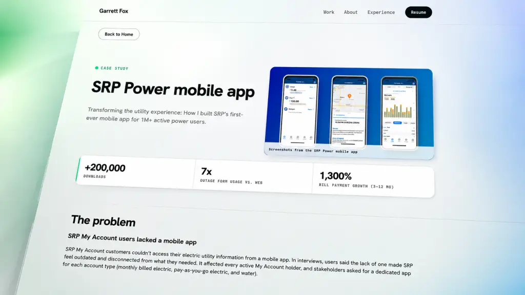
Meridian components in production across the portfolio’s case study pages.
The problem
Saying "I know design systems" is not the same as showing you have built one
Most designer portfolios list “design systems” as a skill. Very few point at a live, documented system with tokens, components, accessibility rationale, and a working code-side implementation. Meridian was built to close that gap. The goal was to prove the claim, not just assert it. This portfolio site you are reading is one of the pages Meridian powers.
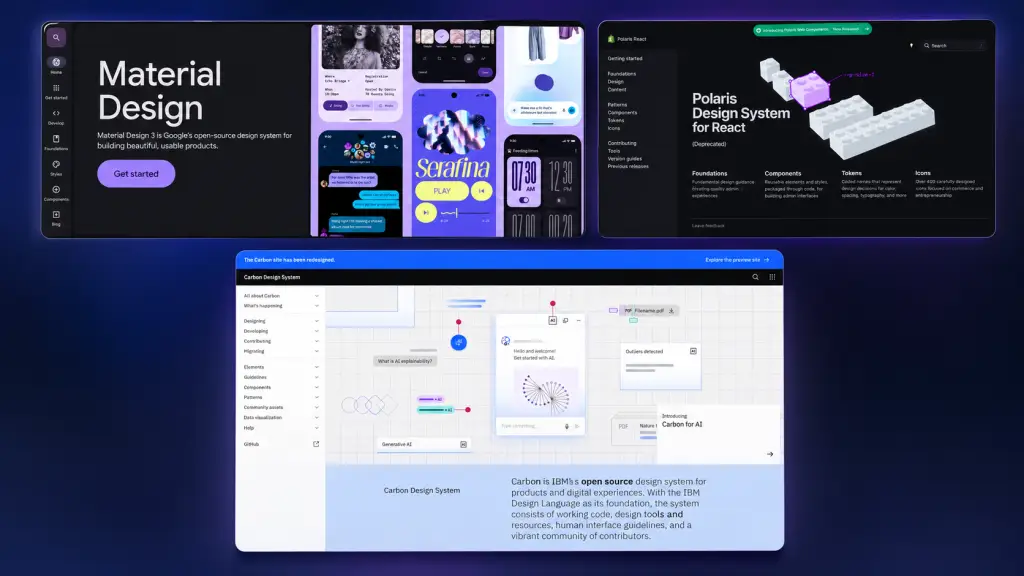
Generic template design systems that Meridian was built to move beyond.
Solo build, no support system: no PM to align stakeholders, no dev partner to catch impossible ideas, no research team to validate patterns. Every decision (from what tokens to include to how to document components) had to be made and defended by one person. The system had to stay small enough to actually finish and shipping-ready enough to hold up in production.
Real production constraints: Meridian had to power a live portfolio site with multiple case study pages, not sit on a Figma board. That meant working with Elementor’s widget architecture, a real theme, image loading, video embeds, and content that could not be controlled at design time. Design decisions that looked good in isolation had to also work in production.
Objectives
Build a real system, not a mood board
Concrete tokens, documented components, and a way to add a badge or a media card just by naming it in a CSS class. If a component takes half an hour to recreate every time, the system did not do its job.
Make accessibility the foundation, not a checklist
WCAG 2.1 AA compliance is table stakes for utility work. Rather than treating accessibility as a final review step, every token and component was designed with it built in from the start. Contrast ratios validated on every color pair. Focus states designed alongside default states. Target sizes documented per component.
Ship it live, not just documented
A design system that only lives in a design tool is not a system. Meridian had to work as running code (three mu-plugins), as live components (native Elementor widgets with utility classes), and as readable documentation (the spec sheet you can visit right now).
Approach
Research
Before writing any tokens, I audited the design systems I have looked up to. Material Design, Shopify Polaris, IBM Carbon, and Atlassian’s system. The goal was not to copy any of them. It was to understand what they had in common and where each made trade-offs, so Meridian could make deliberate choices instead of inherited ones.
I also audited my own past work at SRP. Which patterns had I reached for repeatedly? Where had I invented one-off components because there was no established one? The pattern that emerged was consistent. Utility experiences need clear typography, restrained color, and strong accessibility. That formed the foundation Meridian was built on.
Key insight from the audit: the systems I respected most were not the biggest or the most detailed. They were the ones with the fewest tokens and the strongest opinions about how to use them. Restraint was the pattern. Meridian was scoped down deliberately: just enough tokens to cover the work, no more.
Design system audits and references. Meridian’s foundation drew from Material, Polaris, Carbon, and Atlassian.
Design
With the audit done, the design work focused on three layers. Token architecture (color, typography, spacing, radii, motion), component patterns (buttons, badges, cards, forms, layouts), and documentation (the spec sheet, which is itself built entirely with Meridian components).
Token architecture: Meridian is built from five token groups. Colors (Ink, Neon, Deep Green, plus surfaces and semantic pairs), typography (Hanken Grotesk for sans, JetBrains Mono for mono), spacing (a 4px baseline scale), radii (pill, 18, 8, 2), and motion (three duration steps, two easing curves). Every token is a CSS custom property, which means Meridian ships as running code rather than a specification document.
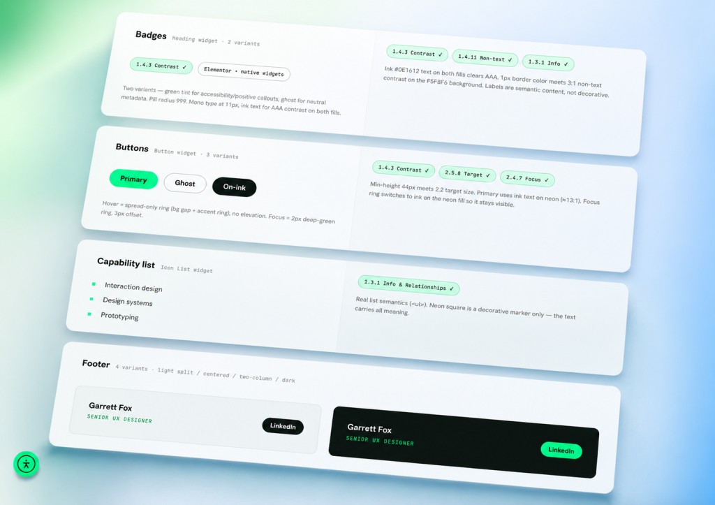
Color token samples. Ink, Neon, Deep Green, plus surfaces and semantic pairs.
Type scale specimens. Hanken Grotesk and JetBrains Mono at every documented size.
Component patterns: eleven components make up the current library. Buttons in three variants, badges in two variants, media cards with striped placeholders, links with hover behavior, project cards, capability lists, stats and experience rows, and a footer treatment. Each component has a clear default state, hover state, and WCAG compliance callout so the design decisions are legible without having to read the CSS.
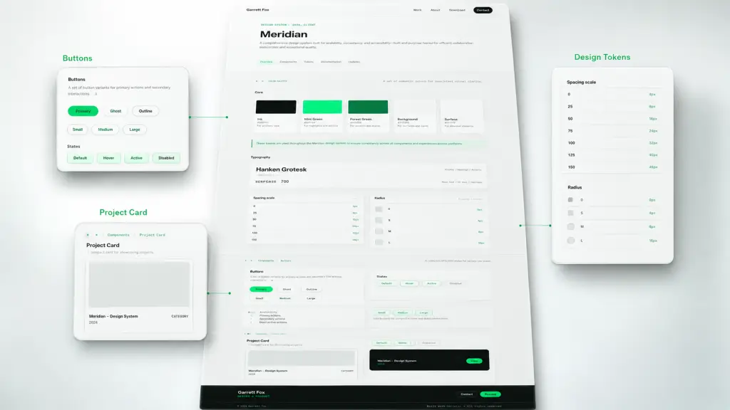
Meridian spec sheet. The living documentation page where every component renders from the same source that powers the case studies.
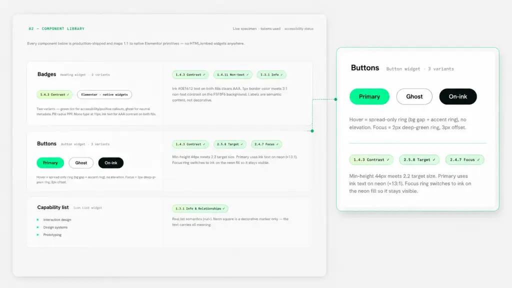
Accessibility checks per component. WCAG 2.1 AA callouts for contrast, focus visibility, target size, and semantic meaning.
Documentation as a first-class deliverable: the Meridian spec sheet is not a description of the system. It is the system. Every component on the spec sheet is a real, live instance of that component. Every WCAG callout points at the exact standard the component meets. Every token value is documented next to its use case. The spec sheet functions as source of truth and sanity check at the same time. You can browse it at the Meridian spec sheet.
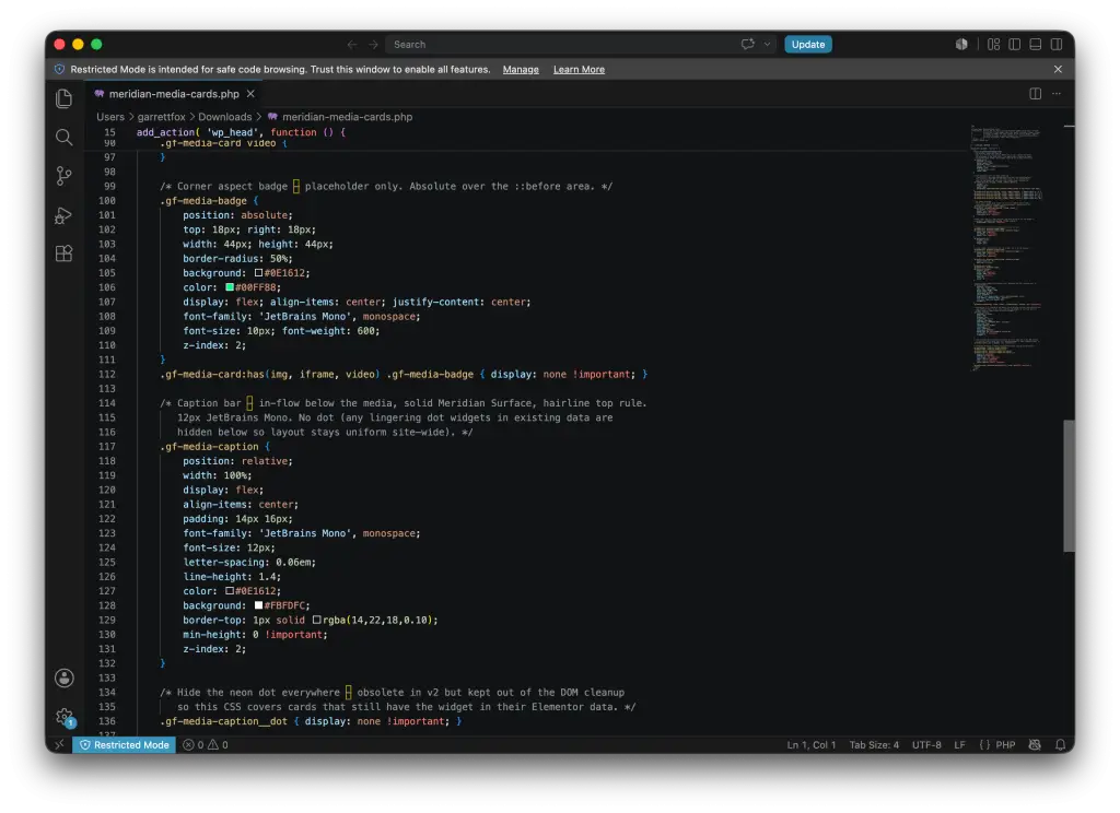
Meridian mu-plugins in the WordPress install. One for buttons, one for badges, one for media cards. Each injects a single stylesheet into wp_head. This slot should show the mu-plugin CSS in a code editor.
Execution
Meridian ships as three mu-plugins in the WordPress install. One for buttons, one for badges, and one for media cards. Each plugin injects a single stylesheet into wp_head, keeping the source of truth centralized rather than scattered across per-widget custom CSS.
On the page side, every component is a native Elementor widget with utility classes applied via the CSS Classes field. Adding a badge means creating a Heading widget with header_size = div and the badge-green class. Adding a media card means creating a Container with gf-media-card and an aspect ratio class. Elementor handles the widget rendering. Meridian handles the visual language. Neither has to know about the other beyond the class name.
Impact
Meridian works. This portfolio site is the proof. Every case study page (SRP Power App, SRP Water App Rewrite, SRP M-Power App, SRP My Account Web Portal) is built on Meridian components. Every hover state, every badge, every media card follows the same source of truth. If any component ever needs to change, it changes once in the mu-plugin and every case study updates in place.
For a hiring manager looking at this portfolio, Meridian is meant to be a signal, not a claim. The system exists as living code you can inspect, a spec sheet you can browse, and a portfolio it actively powers. If a design system role at your team calls for someone who has actually built one end to end (from token architecture to living documentation to shipped production use), Meridian is the artifact backing that up. See it in full on the Meridian spec sheet.
Reflections
Meridian is the smallest possible design system I could build and still call it one. That was intentional. Restraint was the design brief. Looking back, there are a handful of things worth noting for anyone building a portfolio-level design system.
Design systems reveal opinions
You cannot build a design system without taking a position. Every color included is a color left out. Every component documented is a component not needed. Meridian’s opinions are visible in what it does not include. No decorative gradients, no elevated shadows, no default icons. That was as much a design decision as any of the components that made the cut. If a system does not reveal opinions, it is probably not doing its job yet.
Documentation is not a phase, it is the deliverable
The spec sheet was not built after the system. It was built alongside the system, and often ahead of it. Writing the documentation forced the design decisions to be defensible. If a component could not be explained in a sentence, it was probably wrong. Working documentation-first turned the spec sheet into a design tool, not just a reference tool.
Real systems have real production constraints
Meridian looks the way it does partly because Elementor imposed real limits. Widget structure, sanitized inputs, no compiler pipeline. Those constraints shaped the system as much as the design intent did. In hindsight, that was a feature. A design system that only works in a design tool is not really a system. Building against real production friction produced patterns that are more honest about what they actually cost to maintain.
Accessibility as constraint improves everything else
Every WCAG requirement Meridian meets forced a better decision elsewhere. Contrast requirements shaped the color palette. Target size requirements shaped button and badge padding. Focus visibility shaped the interaction states. Treating accessibility as a design constraint from the start (rather than a compliance review at the end) meant the entire system was stronger for it. That is the pattern I would carry into any future design system I build.