SRP Water app rewrite
UX case study on modernizing SRP’s Water app for irrigation customers. Full rewrite, streamlined forms, and a Dashboard that finally shows detail at a glance.
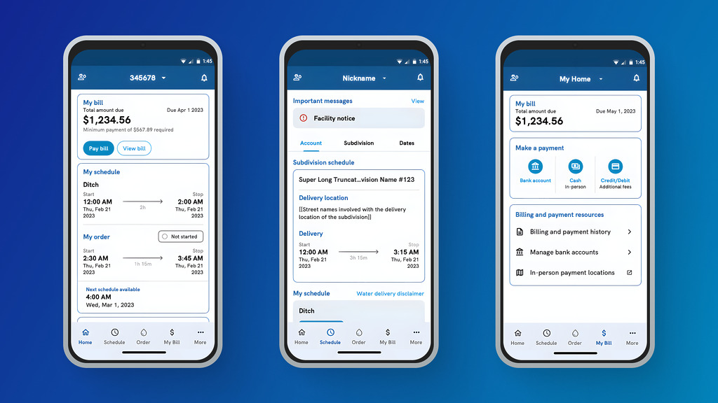
Screenshots from the SRP Water mobile app
The problem
Bring the Water app into the modern age
The SRP Water app needed an overhaul. Customers were stuck with a clunky, outdated interface that hurt usability and engagement. On top of that, Xamarin support was ending in mid-2024, which forced a technical rewrite regardless. Leadership took the opportunity to modernize: migrate from Xamarin to .NET Maui, streamline the most-used forms, update branding to current standards, and add features that would actually help customers. The rewrite was essential to give customers a mobile experience that felt current, intuitive, and worth using.
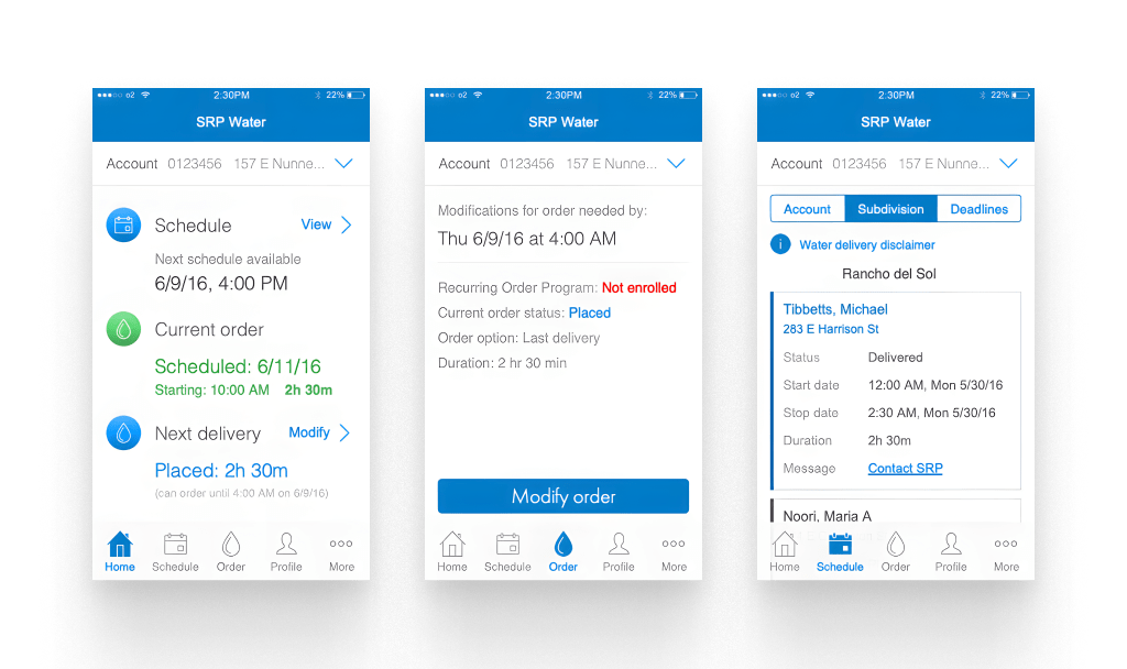
Screenshots from the original Water app (v1.0)
Rewrite-first scope: The core deliverable was the migration from Xamarin to .NET Maui, so new features had to be justified against that budget. Anything that wasn’t essential got scaled back or dropped. An Order History view, which would have let customers see and manage past and future deliveries in one place, was one of the casualties. It was a genuinely useful feature that couldn’t fit inside the migration window.
No user research this time: Unlike other SRP projects, this rewrite ran without an iterative research cycle. Timelines and scope didn’t allow for it. I leaned on recorded feedback from the previous version of the app and applied industry best practices in the flows where the old app visibly struggled. It got the work across the line, but without direct validation, some UI decisions were educated guesses rather than tested outcomes.
Objectives
Preserve what works, sharpen what doesn't
Keep every core feature customers already relied on, and use the rewrite as a chance to clean up the forms and pages that had gotten clunky. No feature removals, no surprises.
Add value without expanding scope
Ship as many quality-of-life improvements as possible without turning a technical rewrite into a feature project. Anything that couldn’t be justified inside the migration budget got parked for a later release.
Bring more customers onboard
Success meant 5,000+ new Water My Account signups after launch, plus measurable improvements to time-on-task for the app’s busiest forms: sign up, order water, and pay a bill.
Approach
Research
Xamarin’s end-of-life announcement in mid-2024 forced the timeline. SRP either rewrote the Water app or lost support for it. Rather than treat that as pure maintenance, leadership used it as an opening to modernize a product that had been declining in performance and getting harder to justify on the app stores.
Unlike other projects at SRP, this rewrite ran without a dedicated user research cycle. Timelines were tight, the migration itself was the deliverable, and formal usability testing did not fit inside the scope. I leaned on two things instead: recorded feedback from the previous version of the app, and industry best practices in the flows and patterns where the old app had visibly struggled.
Key insight from prior feedback: the pain wasn’t feature gaps, it was friction. Multi-step sign-up, forms that got easily lost, and a shallow dashboard were the recurring complaints. That framed the design work. Fix what was already there before adding anything new.
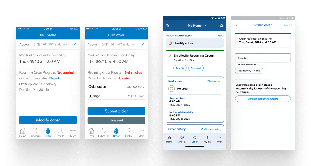
Order water flow comparison. v1.0 left, rewrite right.
Design
The rewrite focused on three fronts. The busiest forms (sign up, bill pay, order water), the Schedule of Subdivision water orders that customers found visually overwhelming, and the Dashboard that had almost no information density.
Streamlining the forms: the original Order Water form lived directly on the page itself, which meant a stray tap could send someone away and lose their in-progress order. In the rewrite it moved to a dedicated page so the task had proper focus. The Sign Up flow had a similar problem. It was spread across multiple steps with fields that showed up unexpectedly. That collapsed into a single form where all requirements are visible up front.
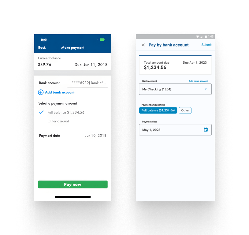
Bill pay form comparison. v1.0 left, rewrite right.
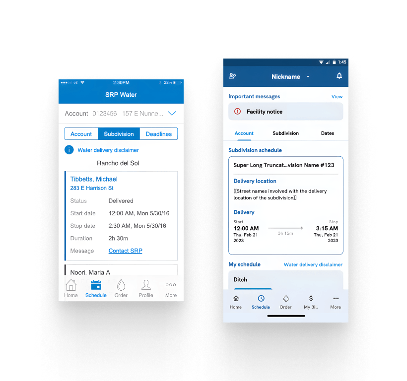
Subdivision schedule comparison. v1.0 left, rewrite right.
Cleaning up the Schedule: the Subdivision water order schedule used to expose every detail of every order at once, which made scanning brutal. The rewrite applied progressive disclosure. You get the summary view first, and details reveal as you drill in. It also added a quick-jump to your own order, a small addition that saved real time when your order sat far down the list.
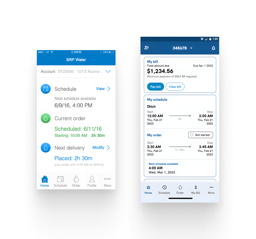
Dashboard comparison. v1.0 left, rewrite right.
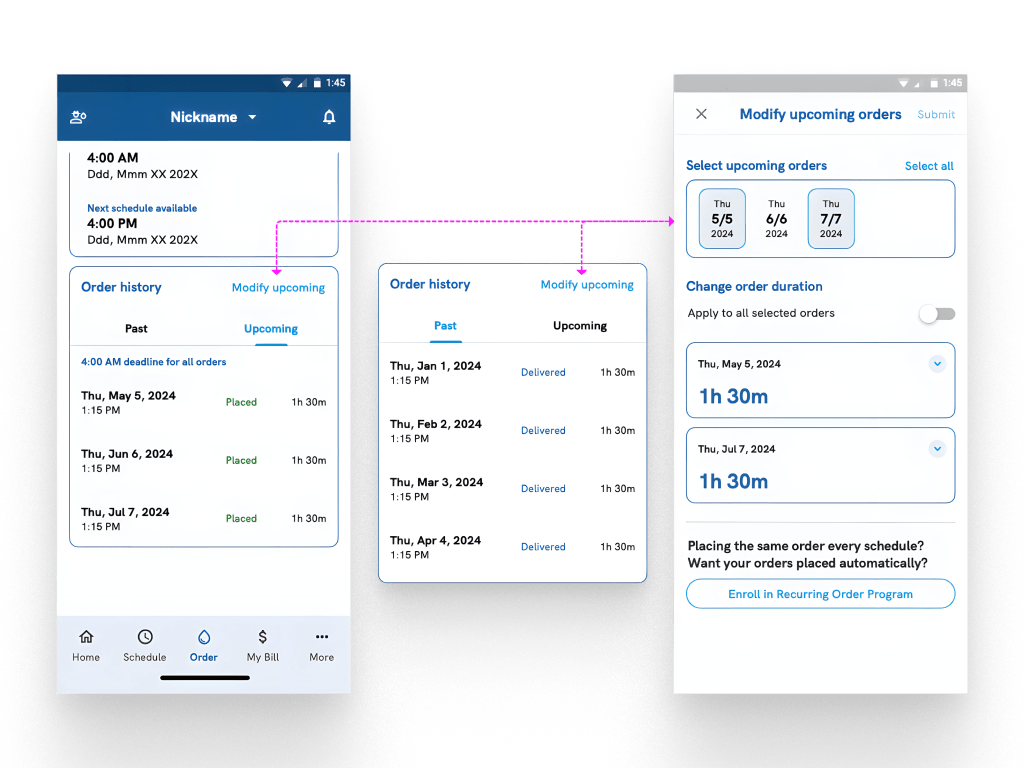
Unused Order History concept. Designed but out of scope.
Deeper Dashboard: the v1.0 Dashboard barely told customers anything about their account. The rewrite added abbreviated summaries of each main section (Schedule, Order, My Bill) so most customers could get what they needed without drilling deeper. For customers on annual or semi-annual billing, the My Bill section only appears when there’s actually a balance to show. That keeps the Dashboard clean when there’s nothing to act on.
Prototype flows used during stakeholder design reviews.
Execution
Mockups and prototypes lived in Axure RP. The app itself was rewritten in .NET Maui, SRP’s replacement for the aging Xamarin toolkit.
As the UX Designer, I owned the mockups and interactive prototypes for stakeholder reviews, then worked closely with developers on translating the designs into .NET Maui components. I also participated in sprint meetings to give design feedback, catch regressions early, and keep the app consistent with SRP’s current branding standards.
Impact
With the app launching in December 2024, meaningful qualitative feedback is still being gathered. As store reviews, ratings, and CS feedback settle in, this section will be updated with what customers are actually saying.
On the business side, the rewrite lowered ongoing maintenance costs by moving off Xamarin’s end-of-life codebase and onto .NET Maui, added biometric authentication (a small change with a big security payoff), and integrated Microsoft Sentry for real-time error monitoring and usage analytics. Following SRP’s move to a third-party My Account platform, future updates to the Water app will come from that vendor.
Reflections
Rewrites are usually treated as maintenance work, but this one had real design impact. Even with a tight scope and no formal research, there were meaningful UX improvements shipped. Looking back, there are a few things I would push harder for next time.
Advocate for user research, even when it's not in scope
This project skipped user research to stay on budget. I understood the constraint at the time, but with hindsight I would have pushed harder to squeeze even a small, informal research pass into the schedule. Even 30 minutes with two or three real customers on a prototype would have surfaced things the old app’s feedback logs couldn’t. Next time, I’d treat lightweight research as non-negotiable rather than a scope tradeoff.
Rewrites deserve their own design time
There’s a temptation to treat rewrites as pure engineering work with the UI along for the ride. On this project, we managed to sneak in real design improvements, but they lived alongside the migration rather than driving it. If I did it again, I’d carve out an explicit design phase inside the rewrite plan, framed as fair game to touch flows and interactions, not just to reskin the existing screens.
Build the post-launch feedback loop before launch
The Water app went live without a clear plan for capturing post-launch feedback beyond app store reviews and Sentry error logs. Rating prompts, in-app feedback flows, and behavioral analytics should have been part of the launch, not add-ons for later. If I could redo the launch prep, I’d wire that feedback loop up on day one so we could start learning from real usage the moment the app shipped.
Rewrites are a chance to modernize the system
The Water app rewrite gave me a fresh look at SRP’s design language and where it was starting to show its age. We updated components to current brand standards, but we did not codify what changed into a shared, reusable system. That is the piece I would invest in next time. A rewrite is one of the few moments where design and dev are both looking at everything at once, so it is an unusually good time to lock down a system that both sides can carry forward.